Once you choose a scenario, you will see two graphs that look like the ones below. The top graph shows the depth of flow over time in response to the storm that is simulated. The depth is in feet and is calculated in relation to the depth of the channel at the location being simulated. The depth is actually calculated for many locations along the stream but the ones shown in these graphs are at the mouth of the stream.
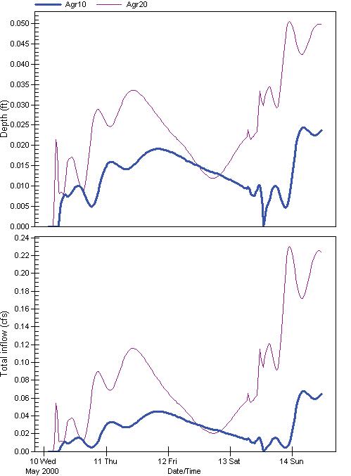
You read the amount from the scale on the left hand side.In this case, the maximum or peak depth for this storm is about 0.023 feet for the Agri10 scenario and 0.050 for the Agri20 scenario. The Agri10 label means the runoff when 10% of the land is changed from forest to agriculture and Agri20 label means the amount of runoff that occurs when 20% of the watershed lands are changed to agriculture. So roughly, we can say that a doubling of the agricultural land use approximately doubles the depth of flow in the stream in response to this storm.
Similarly, the bottom graph shows the amount of runoff in cubic feet per second. The amount on this graph is about 0.07 cfs for Agri10 and 0.23 for Agri20. In this case, the peak runoff increases more than three times when the agricultural land use goes from 10% to 20%.
The scenarios for urban uses show the same graphs but compare the low density, medium density, and high density urban scenarios.
The exact distribution of the land uses for the different scenarios is shown in the table where you select the scenarios. that table shows the actual amount of land use of different types allocated in each of the subcatchments of the Hellbranch Creek.